Leia Chao
NYC-based designer currently creating visuals, videos, and webpages at Pontera︎︎︎ and designing marketing campaigns at Ned︎︎︎
Experienced in social, brand, web, UI/UX, communications, ecommerce, and more.
Resume︎︎︎
Email︎︎︎
LinkedIn︎︎︎
Work
Ned
CLEAR Outcomes Site
Starry
Scout Presents
Alpha Kappa Psi
The Classical Gardens of Suzhou
Accessible Avenues
WorkTogether
Weverse Magazine
Generate Apparel
Posters and More
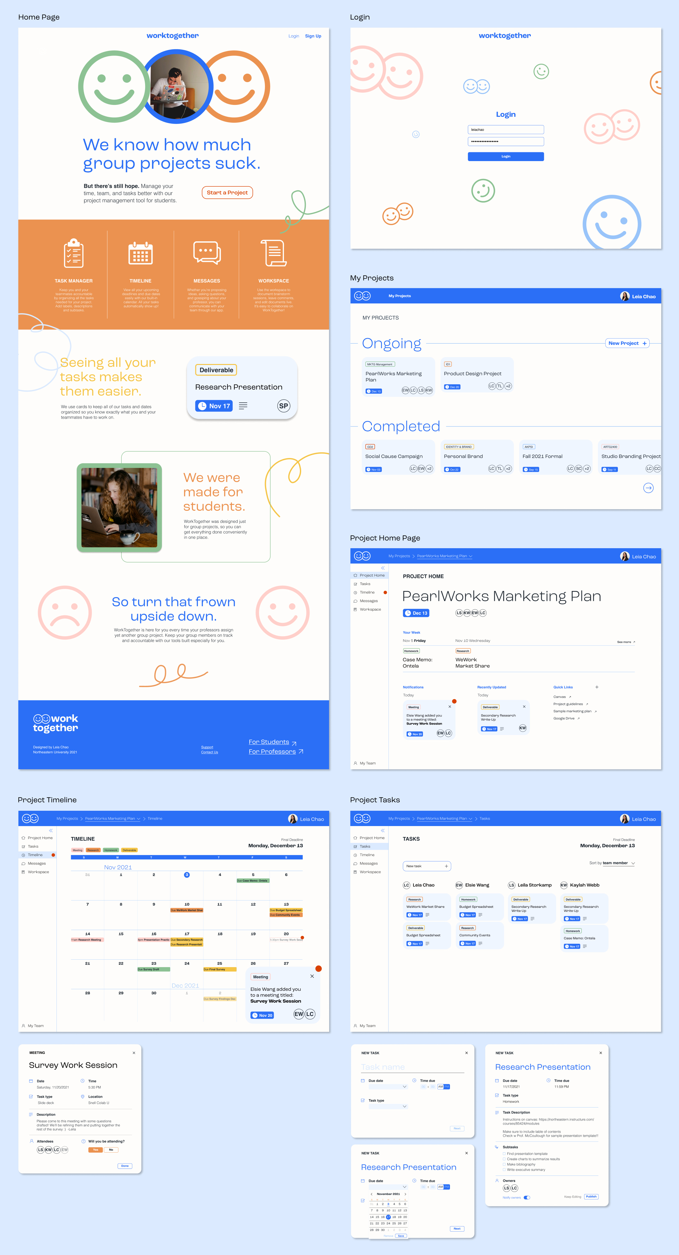
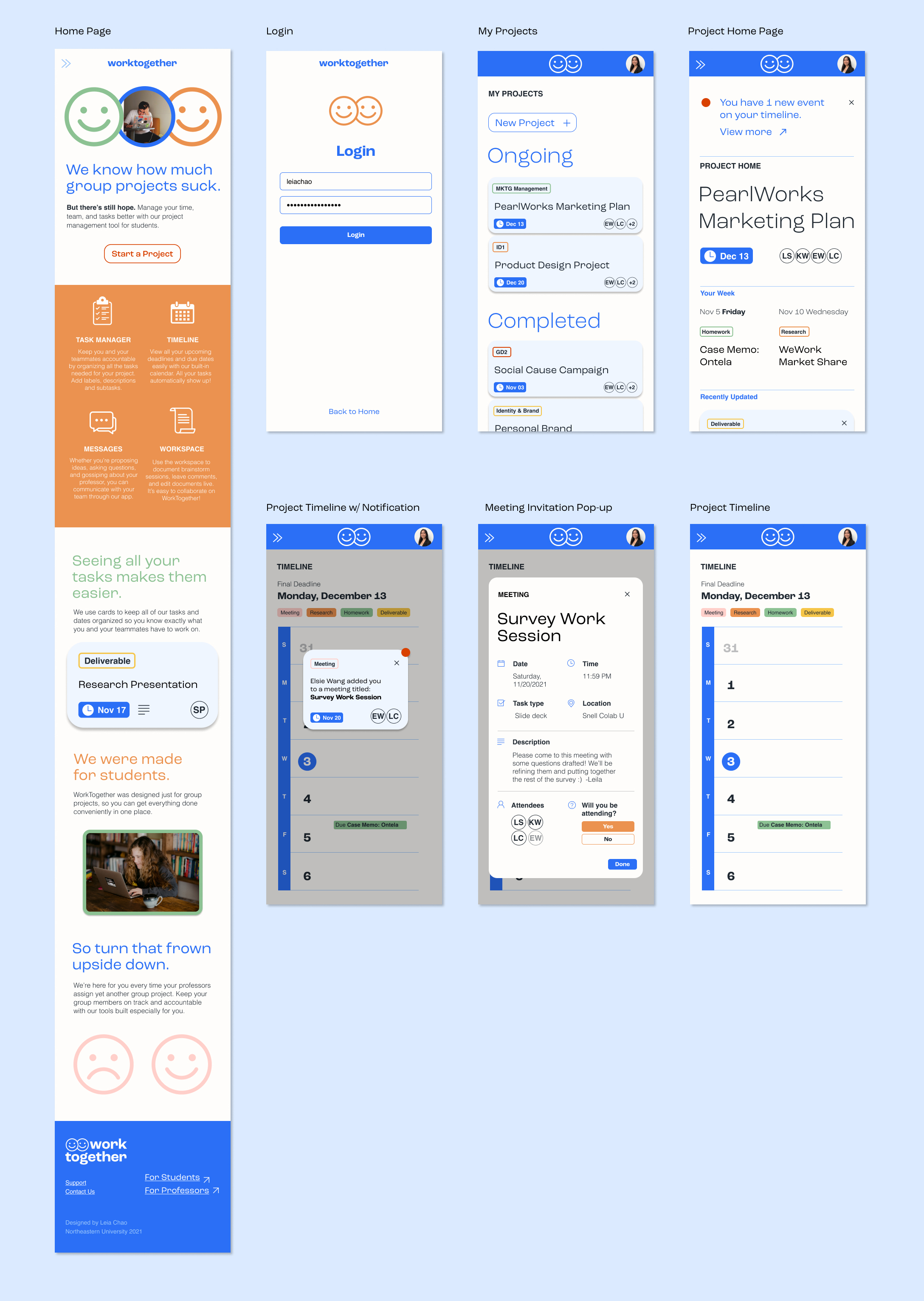
WorkTogether
WorkTogether is a browser-based project management tool designed specifically for students working on group projects. It includes only the essential features high school and college students need to successfully complete their class projects, which are a task manager, calendar/timeline, in-app messaging, and shared workspace. WorkTogether is focused on allowing students to collaborate, communicate, and keep each other accountable.
Brainstorming and Benchmarking
I chose to create a project manager because I felt there were no good pre-existing tools designed specifically for students. Most students use a combination of Google Drive, text, and Canvas/their school's assignment board, which isn't very efficient. On the other hand, project management apps like Notion, Trello, or Wrike designed for huge corporations have an overwhelming number of functions that most students will never use, and a steep learning curve. WorkTogether selects only the most essential features of each and combines them into one simple app.
User Research
After forming the initial idea, I conducted interviews with three different college students and asked them about their experiences working in group projects. I sorted the notes I took for each interview into five different categories that affected their experiences, and whether it was a bright or pain point. This helped me recognize how crucial time management and accountability were to students, and thus refine my site map.
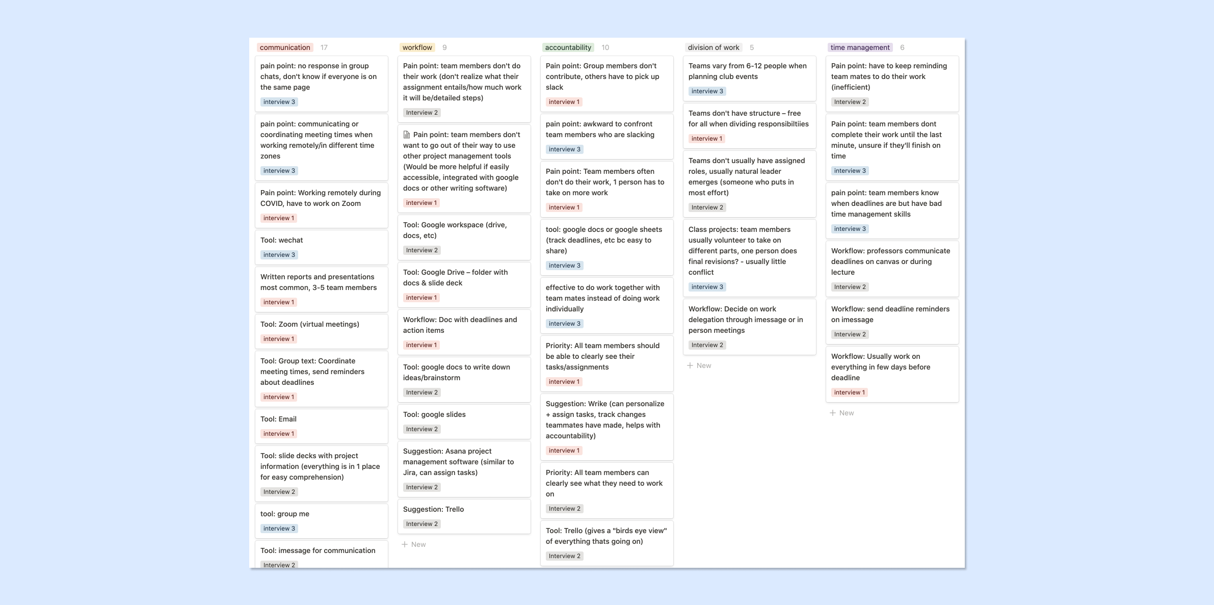
“Some people do their work really last minute, so you don’t know if they’re going to finish on time or not, which makes me really stressed out.”
–Interviewee 1
–Interviewee 1
“People think about their tasks as one bullet point, for example just one slide in the presentation, but that slide actually includes a lot of steps.”
–Interviewee 3
–Interviewee 3
Site Map
This site map visualizes how members of our target market (high school and college students) would flow through the site – which buttons they would click on, which sections needed to be visually differentiated, etc.
![]()
Workflows & Wireframes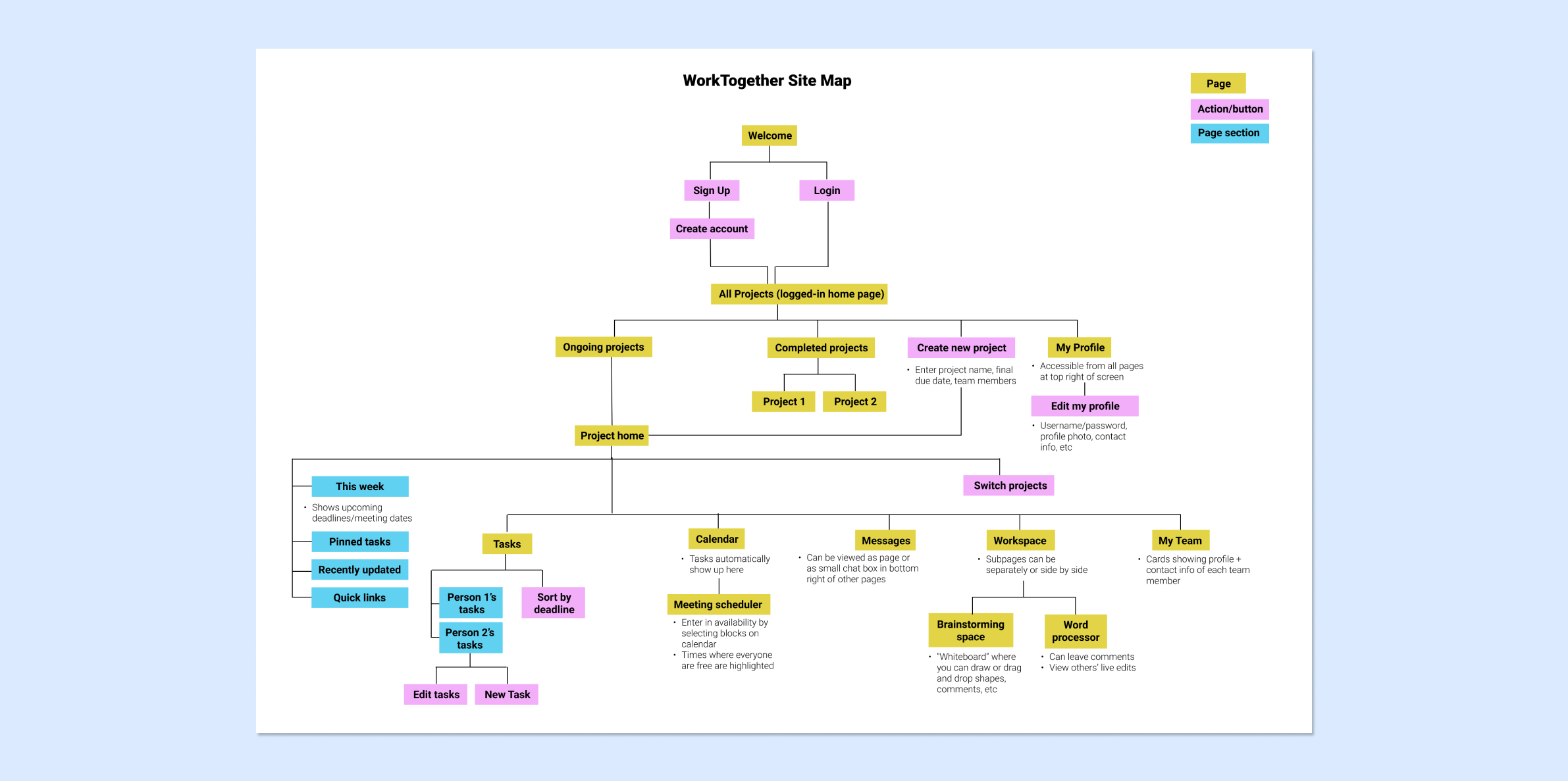
From the site map, I started designing the wireframes for my two main workflows: 1. Accepting a meeting invitation from a teammate, and 2. Creating a new task within a pre-existing project. Based on my user interviews, I determined these as some of the most important and common workflows users would go through on WorkTogether. These wireframes show my initial trials at creating hierarchy with shapes and typography. Since each page is so rich in content, I prioritized making sections easy to read and access from a glance.
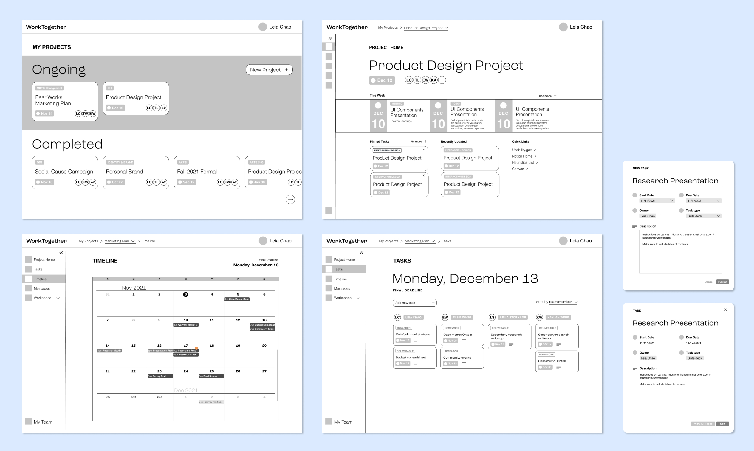
Final Prototype
The final screens for this project really came to life with the implementation of the branding elements and UI components. The sections on each page are clearly differentiated, yet still visually unified by the repeating shapes and colors. Small details like the notification symbol showing up in 3 different places catch your attention, and the color legend on top of the timeline make it easy to understand despite the huge amount of information presented. I created screens for both workflows in desktop view, and for the second one (”Accepting a meeting invitation”) in mobile. You can try out both the desktop︎︎︎ and mobile︎︎︎ prototypes on Figma for yourself!